
One of the uses for measured frequency response functions is to obtain measured versions of mode shapes — a procedure known as experimental modal analysis. We have seen some examples earlier, but now it is time to find out how the method works. It relies on a theoretical result that we discussed way back in section 2.2, with mathematical details in section 2.2.5.
The result can be described, approximately at least, in words. Any frequency response function of a vibrating structure can be written entirely in terms of modal parameters. Each mode, on its own, behaves exactly like a simple damped mass-spring oscillator. The total frequency response is given by adding together these modal contributions. The frequency and the damping factor of each mode is always the same, whichever particular frequency response is calculated. But the amplitude of each modal term in the mixture varies, depending on the positions of the driving point and the observation point. Specifically, the amplitude involves a product: the mode shape evaluated at the driving point, multiplied by the same mode shape evaluated at the observation point.
We should note that everything to be said in this section relies on this theoretical formula. That means that the process cannot be applied to measurements of radiated sound using a microphone, because there simply isn’t a corresponding general formula for that case. So we need to concentrate on mechanical measurements, for example using accelerometers.
Before we introduce the full procedure for finding mode shapes, it is useful to be reminded of how the mass-spring oscillator works. Figure 1 shows the motion of such an oscillator, set off by a hammer tap. The top curve, in red, shows the behaviour with no damping: a sinusoidal vibration at the natural frequency of the oscillator continues for ever, because the energy put in by the hammer tap is never lost. But as soon as we have some damping, the motion decays away.

The decay rate depends on the level of damping, which we can characterise by the damping factor, or its inverse the Q-factor. The remaining curves in Fig. 1 show the behaviour with three different levels of damping, with progressively decreasing Q-factors: 100 for the black curve, 33 for the blue one, and 10 for the green one. The meaning of the Q-factor is particularly easy to visualise here: it tells you the number of cycles needed for the vibration amplitude to reduce by a certain factor (specifically, the factor $e^\pi \approx 23$).
Converting this behaviour into a frequency response, we obtain Fig. 2. Because the measurements we are about to look at were made with an accelerometer, the specific frequency response plotted here is the accelerance: acceleration per unit force, as a function of frequency. The four curves have colours corresponding to Fig. 1. The red curve, for the undamped system, goes off the top of the plot and continues (in theory) to infinity. But all the others have peaks with a finite height. As the damping increases (i.e. as the Q-factor goes down), the peak height reduces.

The “sharpness” of the peak also reduces. The usual way to characterise this is via the “half-power bandwidth”. You find the points on either side of the peak where the amplitude has gone down by a factor $\sqrt{2}$, in other words where the squared amplitude, proportional to the energy in the oscillation, has gone down by a factor of 2. On the decibel scale of these plots, this corresponds to a reduction of level by 3 dB. Now the half-power bandwidth is the difference of these two frequencies. If you divide it by the peak frequency, that gives you the loss factor, which is a dimensionless number. The inverse gives you the Q-factor, so the Q-factor can be visualised as the number of half-power bandwidths you can fit along the frequency axis between zero and the peak.
Now we can turn to some measurements. But we will not use something as complicated as a musical instrument body for this first demonstration. Instead, we will analyse measurements on the steel ruler shown in Fig. 3. The ruler was supported on soft rubber bands, and was tapped with the miniature impulse hammer at 10 points along the mid-line, equally spaced between the two extreme ends. Response was recorded by a small accelerometer stuck to the underside of the ruler, at the right-hand end (you can see the red cable leading from it).

Figure 4 shows a sample of the results. The three curves correspond to tapping points numbers 1, 6 and 9, counting from the left-hand end. The plotted frequency range covers the first four bending resonances of the ruler, which show up as the obvious strong peaks. It is the mode shapes of these bending resonances that we will try to visualise from the set of 10 measured frequency responses.

As an aside, you may be wondering about the smaller peaks that can be seen in this plot. They have two sources. Very sharp features at multiples of 50 Hz are caused by electrical interference (50 Hz is the frequency of the electricity supply in the UK). The broader feature around 260 Hz, particularly clear in the green curve, is a torsional resonance of the ruler. If I had placed my accelerometer and my hammer taps exactly on the centre line of the ruler, this resonance would not have shown up because any torsional mode has a nodal line down the centre. But in practice neither placement will have been exact, so the torsional resonance shows through at a low level.
Returning to the mode shapes underlying the main peaks in Fig. 4, it is now easy to explain roughly how the method works. I will first do it by “hand-waving”, then fill in the more technical details of the method. These peaks are well separated from each other, so that for frequencies close to a peak, the response will be dominated by a single modal contribution. That should produce a frequency response very similar to Fig. 2. We can thus deduce the modal frequency by looking at the peak frequency, and the modal damping by finding the half-power bandwidth. We should get the same answer from all 10 measurements, except that for any particular mode, certain tapping positions will fall near nodal points and so the peak will not appear very strongly. For example, the second peak hardly appears in the green curve in Fig. 4.
Now we look at the peak height, and see how it varies across the 10 different tapping positions. Remember what the formula tells us: the height should be proportional to the mode shape evaluated at the tapping position. It is also proportional to the mode shape evaluated at the measurement position, but that stays fixed throughout the experiment so it does not influence anything provided we have fixed our accelerometer in a position that is not near a nodal line for any mode we are interested in.
So the variation of peak height should map out the mode shape. But there is a snag if we only look at plots like Fig. 4, showing the magnitude of the response. We would have no way to distinguish positive from negative values of the modal amplitude, so we would only see the shape in a “rectified” form. The measured frequency response functions do contain the information we want, but we have to look at them a little harder.
The next part of the description will involve the mathematical idea of “complex numbers”. Don’t worry if that is mysterious to you: just skip lightly over the details until you get to Fig. 8, which is the payoff for introducing the concept here. That figure, when we reach it, gives a very immediate visualisation of the thing we are trying to do, and that is all you really need to understand. But before we get there, I want to show something else to give an inkling of how the technical computer processing might work.
The measured frequency responses contain information about phase as well as amplitude, and that is what we need to resolve the issue of what is positive and what is negative. The way the information is actually coded in the computer is in terms of complex numbers, which are the sum of a “real part” and an “imaginary part”. Figure 5 shows the same data as Fig. 4, but plotting the real and imaginary parts separately.


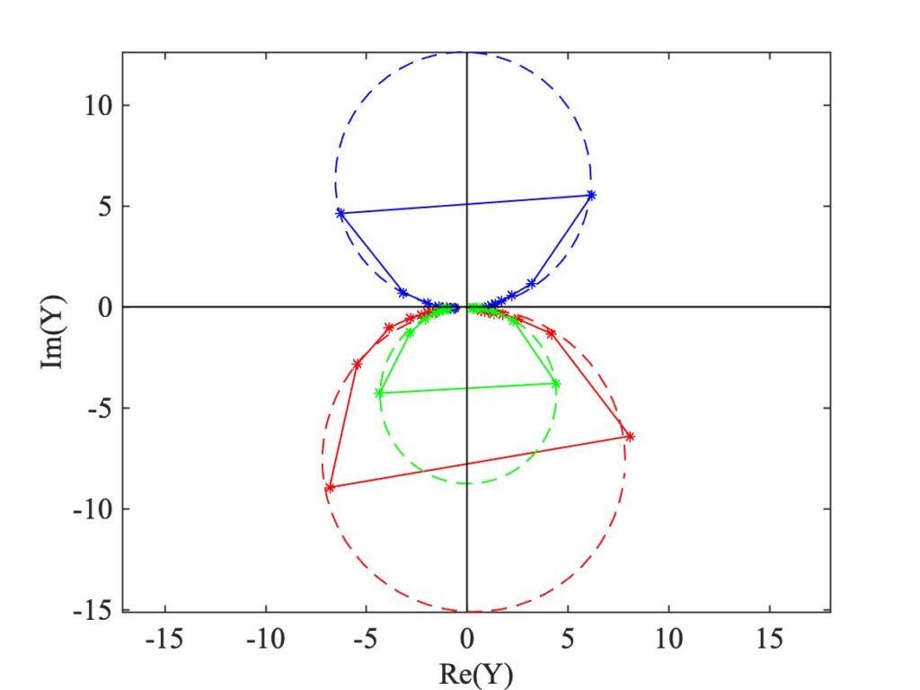
Now we concentrate on a narrow frequency range near one of the strong peaks, and instead of plotting the two parts against frequency, we plot the imaginary part against the real part. Something unexpected and somewhat magical then happens: an example, for a range of frequencies near the 4th resonance, is shown in Fig. 6. It is immediately obvious that the points dot out perfect circles. The three channels of data are indicated by the same colour code as before, and the measured data points are shown as stars. The lines connecting these stars are just a guide to the eye: we only have data at particular frequencies governed by the resolution of our measurement — in this case, that resolution is 0.5 Hz.

The dashed line shows the computer’s “best-fitted” circle in each case. The reason behind the appearance of these circles is explained in the next link, along with some other mathematical details. But notice where the circles are located in the plot. The origin (0,0) does not lie in the centre of any of the circles, as you might have guessed. Instead, each circle nearly passes through the origin. In fact, if we had plotted the corresponding diagram for the mass-spring oscillator resonance from Fig. 2, we would have obtained a circle passing almost exactly through the origin. The reason the measured circles don’t quite do this is because of the small but non-zero influence of the other modes, at higher and lower frequencies. The link fills in some detail on all this.
Now, the amplitude that we plotted in Fig. 4 is given, at each frequency, by the distance of the corresponding star from the origin. So to identify the peak of amplitude, we need to look for the star which is furthest from the origin. This occurs more or less at the top of the red and green circles, and at the bottom of the blue circle. The fact that the blue circle goes downwards when the other two go upwards is precisely the distinction we are looking for: the modal amplitude for this mode is positive for the red and green data, but negative for the blue data.
I deliberately chose to show data for the 4th mode for this initial discussion. But we can see why these theoretical circles might be important when we plot the corresponding diagram for the lowest mode, in Fig. 7. The stars are far more sparse here, because the corresponding resonance peak is narrower so that the 0.5 Hz frequency resolution has a bigger impact. But the computer has still been able to fit circles, because there is in fact enough information in these sparse measured points. As it has turned out, none of the circles show a star near their respective tops or bottoms: the actual peak frequency seems to be about half-way between two stars. We can use these fitted circles to predict the true height, and hence the true modal amplitude factor: it is given by the diameter of the corresponding circle.
Modal analysis software takes advantage of things like circle-fitting, and more sophisticated processing to take account of the influence of other modes. But we can close this preliminary account with a graphic which gives a clear impression of how things work without needing very much clever processing. What we have seen in Figs. 6 and 7 is that the important features of each peak are contained in the variation on the vertical axis, in other words in the imaginary part of each frequency response function.
Figure 8 shows a plot of that imaginary part, now for all 10 tapping positions. They are laid out in a three-dimensional manner, for a frequency range that covers the first three bending resonances of the ruler. The peak corresponding to the lowest resonance is marked by a red dot on each curve, and these dots are connected by dashed lines as a guide to the eye. Green dots and lines mark the second mode, and yellow ones mark the third mode. (A detail: in order to generate this plot while avoiding the issue highlighted by Fig. 7, the frequency resolution was made finer by a factor of 4 using FFT-based interpolation with zero-padding, mentioned in section 10.4.2.)

The red, green and yellow points correspond rather convincingly to the mode shapes we are expecting for our ruler, which is a free-free bending beam as discussed back in section 3.2.1. To remind you, animations of those three modes are shown in Fig. 9(a)—(c). The measured shapes are not quite symmetrical, unlike the theoretical ones. This is not an error: it shows the influence of the mass of the accelerometer attached at one end of the beam.
Having seen how experimental modal analysis works through that simple example, we can look at some results for instrument bodies. Yet again, I will show “signature modes” of a violin body. Modal measurements by two different people will be shown: George Stoppani and George Bissinger. You can see George Stoppani in Fig. 10, doing a modal scan on a cello assisted by Ailin Zhang. The cello is suspended on rubber bands at the neck and the endpin, and the strings are damped (including the afterlength strings between the bridge and the tailpiece). He has a single accelerometer fixed to the cello, and he is tapping with his impulse hammer over a grid of points covering the body.

George Bissinger’s measurements are made by the reciprocal method: his hammer always taps on the bridge, and he uses a scanning laser vibrometer to measure the response at many points in turn. For both of them, the resolution of the modal images is determined by how many measurement points they are prepared to use. To get good images you have to be prepared to patient, and test a lot of points! George Bissinger’s set of measurement points can be seen in Fig. 11, for a violin.
I will first show three different representations of the signature mode A0, the “air resonance”. Figure 12 shows a still image of the motion of the top and back plates of the violin in this mode, as measured by George Stoppani. Figure 13 shows a 3D animated view of the same mode, also measured by him. Figure 14 shows a George Bissinger measurement of the same mode (on a different violin). This video is reproduced from the web site of the Strad3D project.

We can learn a number of things by comparing these images. The first thing that strikes you, probably, is the different style of graphics. The Bissinger plot is generated by general-purpose commercial software, in the form of a “wire frame” representation. It shows the actual grid of measurements points, simply connected by straight lines. It has some virtues: you see the complete violin rather than the separated plates, and you can see through the top plate to the other side. On the downside it looks a bit crude, and perhaps it is not completely clear what is going on in the motion depicted.
The Stoppani images are quite different. George Stoppani is a violin maker, and makers care a lot about design details like the plate outline, corner shapes and f-holes. So when he wrote his rather impressive software package for modal analysis, he incorporated options to design realistic violin shapes. He also uses a more sophisticated representation of the vibrating shape, using smooth interpolation between the measurement points. This has the virtue of making the plots look nicer, with the possible associated disadvantage that you lose sight of the resolution of the underlying measurements — in fact his measurement grid has a similar resolution to the Bissinger grid seen in Fig. 11.
The next obvious difference is that the Bissinger plot shows the complete violin, with its neck, fingerboard, tailpiece and so on. The Stoppani plot just shows the top and back plates of the body. This is simply a choice made for display purposes — both styles have advantages. There is something else that is not a matter of choice, though: the Bissinger plot is fully three-dimensional, whereas the Stoppani plot shows only motion normal to the plane of the body. For this particular set of measurements, George Bissinger had access to an advanced (and very expensive) 3D laser vibrometer system.
The Bissinger image of the complete instrument reveals that this mode involves significant vibration of the neck and, especially, the projecting length of the fingerboard. The extent to which this happens depends on exactly how the instrument maker has shaped the fingerboard: the strongest coupling with the “air mode” A0 occurs when the resonance frequency of the fingerboard cantilever is tuned to roughly the same frequency. This coupling is liked by some players, probably because the instrument feels more “alive” to them when they feel vibration of the neck through their left hand [1].
The final feature that distinguishes the Stoppani and Bissinger plots is a slight digression from the perspective of this section, but it is significant in terms of the underlying physics. The Bissinger plot shows two yellow f-hole shapes, that “float” up and down during the vibration. These are not part of the modal analysis, but an extra feature added to the graphic from a different measurement on the same violin. They show a visualisation of the “Helmholtz air pistons”, breathing in and out through the f-holes, deduced by a method called “near-field acoustic holography” [2]: we will say a bit more about this approach in section 10.6.
The mode A0 is a modified Helmholtz resonance, and so we are not surprised to see very vigorous motion of these invisible pistons, in phase for the two f-holes. From the discussion in section 4.2, we expect that the volume change associated with the plate motion will be in the opposite phase to volume change associated with the f-hole flows. The sound radiation is dominated by the f-holes, and somewhat reduced by the associated plate motion.
However, the plate motion is crucial: A0 can only be excited during normal violin playing via string forces at the bridge, and for that to work there has to be bridge motion associated with the mode. That bridge motion is perhaps made most clear by the visualisation in Fig. 13: there is obvious rocking motion in the “island” area between the f-holes, and this will carry the bridge along with it. The main reason for this strong rocking motion is the effect of the soundpost. You can see in Figs. 12 and 13 that A0 has a node line (showing white in the plots) passing very near the soundpost position.
Figures 15, 16 and 17 show the same three visualisations of the violin signature mode CBR. In this mode, the violin body behaves a bit like a very thick flat plate: the top and the back move in more or less the same shape, as is particularly clear in Fig. 15. The nodal lines of this mode shape give no clue about the soundpost position, because the post is carried up and down by the top and back moving in synchrony.
Figure 17, showing the motion in 3D, reveals that there is significant rotation/shearing of the ribs in the C-bouts of the violin. This is where the mode gets its acronym: CBR stands for “C-bouts rhomboidal”. That figure also shows that the two f-hole “air pistons” are moving in opposite directions. Every aspect of this mode shape is rather symmetrical about the long axis of the body, so it has virtually no net volume change, and therefore it is not a good radiator of sound.

Figures 18, 19 and 20 show the same three visualisations of the mode B1-, and Figures 21, 22 and 23 show the related mode B1+. These two modes are sometimes called “baseball modes”: Figs. 18 and 21 reveal that in both cases there is a single sinuous node line that snakes around the body in a pattern like the seam of a baseball. The white nodal line travels off the edges of the top plate and reappears at more or less the same position on the back plate, then travels across that and skips back to the top plate, and so on. In B1-, the node line is aligned roughly lengthways on the top, and crossways on the back; in B1+ the pattern is reversed.
Both modes are rendered significantly asymmetric by the effect of the soundpost (and to a lesser extent the bass bar). In consequence, both have significant volume change. This leads to symmetrical motion of the two f-hole “pistons”, as is clear in Figs. 20 and 23. Both modes are efficient radiators of sound, and they play a very important role in the low-frequency sound of a violin. Both also involve significant rocking motion of the bridge, which allows them to be driven effectively by forces from the bowed string. Indeed, especially in the case of B1+, the bridge motion can be so strong that a wolf note is caused (see section 9.4).


[1] J. Woodhouse, “The acoustics of ‘A0-B0 mode matching’ in the violin”, Acta Acustica united with Acustica 84, 947–946 (1998)
[2] George Bissinger, Earl G. Williams and Nicolas Valdivia, “Violin f-hole contribution to far-field radiation via patch near-field acoustical holography”, Journal of the Acoustical Society of America 121, 3899—3906 (2007)